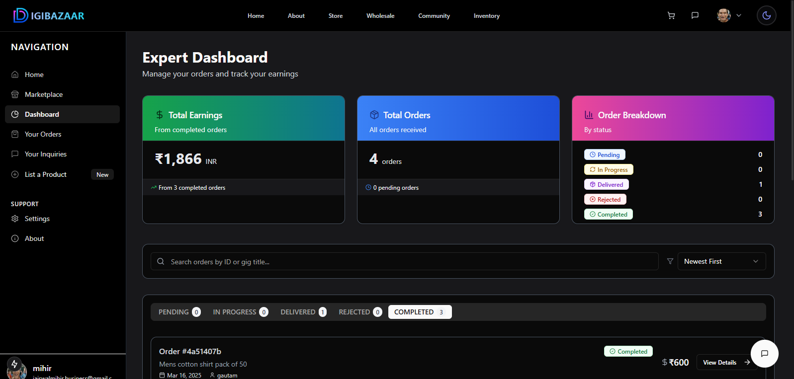
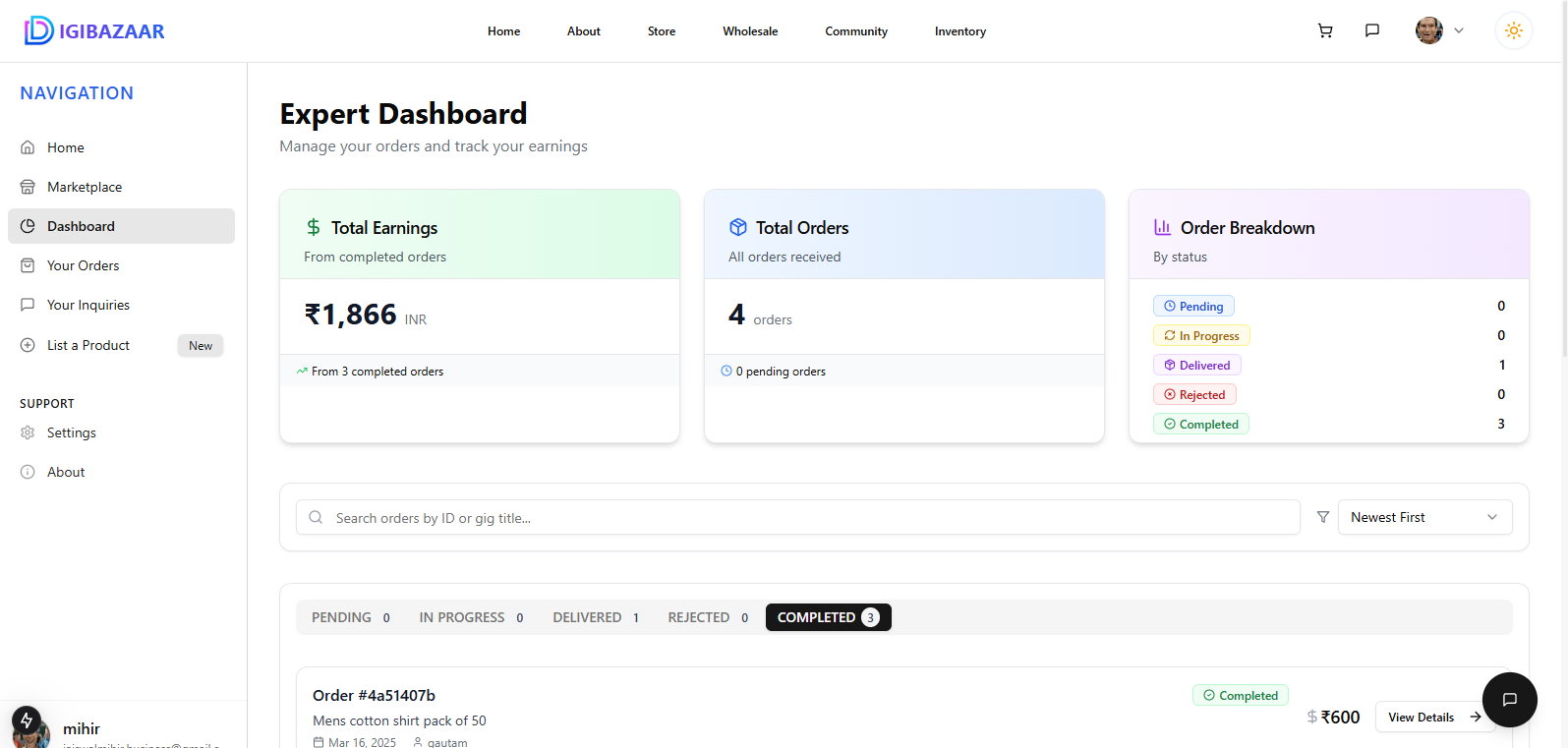
Image Comparison
An interactive image comparison slider that allows users to drag or hover to reveal two different images.
Image Comparison


Installation Guide
1
Install Dependencies
Framer Motion
npm install framer-motionUtility Functions
npm install clsx tailwind-merge2
Setup Configuration
Create file:
/lib/utils.ts/lib/utils.ts
Configuration1import { clsx, type ClassValue } from "clsx";
2import { twMerge } from "tailwind-merge";
3
4export function cn(...inputs: ClassValue[]) {
5 return twMerge(clsx(inputs));
6}3
Copy Component Code
Image Comparison.tsx
TypeScript1"use client";
2
3import { cn } from "@/lib/utils";
4import {
5 useState,
6 createContext,
7 useContext,
8 useEffect,
9 ReactNode,
10 useRef,
11} from "react";
12import {
13 motion,
14 MotionValue,
15 useMotionValue,
16 useSpring,
17 useTransform,
18 AnimationOptions,
19} from "framer-motion";
20
21const SliderContext = createContext<
22 | {
23 position: number;
24 setPosition: (pos: number) => void;
25 motionPosition: MotionValue<number>;
26 orientation: "horizontal" | "vertical";
27 isDragging: boolean;
28 contentDimensions: { width: number; height: number } | null;
29 }
30 | undefined
31>(undefined);
32
33export type ContrastSliderProps = {
34 children: React.ReactNode;
35 className?: string;
36 hoverControl?: boolean;
37 orientation?: "horizontal" | "vertical";
38 defaultPosition?: number;
39 animationConfig?: Partial<AnimationOptions>;
40 dividerColor?: string;
41 constrainToContent?: boolean;
42};
43
44const DEFAULT_ANIMATION_CONFIG = {
45 damping: 15,
46 stiffness: 400,
47 mass: 0.4,
48};
49
50function ImageSlider({
51 children,
52 className,
53 hoverControl = false,
54 orientation = "horizontal",
55 defaultPosition = 50,
56 animationConfig,
57 dividerColor,
58 constrainToContent = false,
59}: ContrastSliderProps) {
60 const [isActive, setIsActive] = useState(false);
61 const baseMotion = useMotionValue(defaultPosition);
62 const springMotion = useSpring(
63 baseMotion,
64 animationConfig ?? DEFAULT_ANIMATION_CONFIG
65 );
66 const [position, setPosition] = useState(defaultPosition);
67 const [contentDimensions, setContentDimensions] = useState<{
68 width: number;
69 height: number;
70 } | null>(null);
71 const containerRef = useRef<HTMLDivElement>(null);
72
73 const motionToUse = hoverControl ? baseMotion : springMotion;
74
75 useEffect(() => {
76 baseMotion.set(defaultPosition);
77 setPosition(defaultPosition);
78 }, [defaultPosition, baseMotion]);
79
80 useEffect(() => {
81 if (containerRef.current) {
82 const updateDimensions = () => {
83 const container = containerRef.current;
84 if (!container) return;
85
86 const firstImg = container.querySelector("img");
87 if (!firstImg) return;
88
89 if (firstImg.complete) {
90 calculateDimensions(firstImg);
91 } else {
92 firstImg.onload = () => calculateDimensions(firstImg);
93 }
94 };
95
96 const calculateDimensions = (img: HTMLImageElement) => {
97 const container = containerRef.current;
98 if (!container) return;
99
100 const { naturalWidth, naturalHeight } = img;
101 const containerParent = container.parentElement;
102 const maxWidth = containerParent?.clientWidth || window.innerWidth;
103 const maxHeight = containerParent?.clientHeight || window.innerHeight;
104 let width, height;
105 const aspectRatio = naturalWidth / naturalHeight;
106
107 if (constrainToContent) {
108 if (naturalWidth > maxWidth) {
109 width = maxWidth;
110 height = maxWidth / aspectRatio;
111 } else if (naturalHeight > maxHeight) {
112 height = maxHeight;
113 width = maxHeight * aspectRatio;
114 } else {
115 width = naturalWidth;
116 height = naturalHeight;
117 }
118 } else {
119 const containerRatio = maxWidth / maxHeight;
120
121 if (aspectRatio > containerRatio) {
122 width = maxWidth;
123 height = maxWidth / aspectRatio;
124 } else {
125 height = maxHeight;
126 width = maxHeight * aspectRatio;
127 }
128 }
129
130 setContentDimensions({ width, height });
131 };
132
133 updateDimensions();
134
135 window.addEventListener("resize", updateDimensions);
136
137 return () => {
138 window.removeEventListener("resize", updateDimensions);
139 };
140 }
141 }, [constrainToContent]);
142
143 const handleInteraction = (event: React.MouseEvent | React.TouchEvent) => {
144 if (!isActive && !hoverControl) return;
145
146 const container = (
147 event.currentTarget as HTMLElement
148 ).getBoundingClientRect();
149
150 let clientX, clientY;
151 if ("touches" in event) {
152 clientX = event.touches[0].clientX;
153 clientY = event.touches[0].clientY;
154 } else {
155 clientX = (event as React.MouseEvent).clientX;
156 clientY = (event as React.MouseEvent).clientY;
157 }
158 let interactiveLeft = container.left;
159 let interactiveTop = container.top;
160 let interactiveWidth = container.width;
161 let interactiveHeight = container.height;
162
163 if (contentDimensions) {
164 const offsetX = (container.width - contentDimensions.width) / 2;
165 const offsetY = (container.height - contentDimensions.height) / 2;
166
167 interactiveLeft += offsetX;
168 interactiveTop += offsetY;
169 interactiveWidth = contentDimensions.width;
170 interactiveHeight = contentDimensions.height;
171
172 if (
173 clientX < interactiveLeft ||
174 clientX > interactiveLeft + interactiveWidth ||
175 clientY < interactiveTop ||
176 clientY > interactiveTop + interactiveHeight
177 ) {
178 return;
179 }
180 }
181
182 let percentValue;
183 if (orientation === "horizontal") {
184 const xPos = clientX - interactiveLeft;
185 percentValue = Math.min(
186 Math.max((xPos / interactiveWidth) * 100, 0),
187 100
188 );
189 } else {
190 const yPos = clientY - interactiveTop;
191 percentValue = Math.min(
192 Math.max((yPos / interactiveHeight) * 100, 0),
193 100
194 );
195 }
196
197 baseMotion.set(percentValue);
198 setPosition(percentValue);
199 };
200
201 return (
202 <SliderContext.Provider
203 value={{
204 position,
205 setPosition,
206 motionPosition: motionToUse,
207 orientation,
208 isDragging: isActive || hoverControl,
209 contentDimensions,
210 }}
211 >
212 <div
213 ref={containerRef}
214 className={cn(
215 "relative select-none overflow-hidden rounded-lg",
216 constrainToContent ? "inline-block" : "w-full h-full",
217 hoverControl &&
218 (orientation === "horizontal"
219 ? "cursor-ew-resize"
220 : "cursor-ns-resize"),
221 className
222 )}
223 onMouseMove={handleInteraction}
224 onMouseDown={() => !hoverControl && setIsActive(true)}
225 onMouseUp={() => !hoverControl && setIsActive(false)}
226 onMouseLeave={() => !hoverControl && setIsActive(false)}
227 onTouchMove={handleInteraction}
228 onTouchStart={() => !hoverControl && setIsActive(true)}
229 onTouchEnd={() => !hoverControl && setIsActive(false)}
230 style={
231 {
232 "--divider-color": dividerColor || "#ffffff",
233 width: contentDimensions
234 ? `${contentDimensions.width}px`
235 : undefined,
236 height: contentDimensions
237 ? `${contentDimensions.height}px`
238 : undefined,
239 display: "flex",
240 justifyContent: "center",
241 alignItems: "center",
242 } as React.CSSProperties
243 }
244 >
245 <div
246 className="relative overflow-hidden rounded-lg"
247 style={{
248 width: contentDimensions ? `${contentDimensions.width}px` : "100%",
249 height: contentDimensions
250 ? `${contentDimensions.height}px`
251 : "100%",
252 }}
253 >
254 {children}
255 </div>
256 </div>
257 </SliderContext.Provider>
258 );
259}
260
261type ImageLayerProps = {
262 className?: string;
263 alt: string;
264 src: string;
265 layer: "first" | "second";
266 loading?: "lazy" | "eager";
267 priority?: boolean;
268};
269
270const ImageLayer = ({
271 className,
272 alt,
273 src,
274 layer,
275 loading = "eager",
276 priority = false,
277}: ImageLayerProps) => {
278 const { motionPosition, orientation } = useContext(SliderContext)!;
279
280 const firstLayerClip = useTransform(motionPosition, (value) =>
281 orientation === "horizontal"
282 ? `inset(0 0 0 ${value}%)`
283 : `inset(${value}% 0 0 0)`
284 );
285
286 const secondLayerClip = useTransform(motionPosition, (value) =>
287 orientation === "horizontal"
288 ? `inset(0 ${100 - value}% 0 0)`
289 : `inset(0 0 ${100 - value}% 0)`
290 );
291
292 return (
293 <motion.img
294 src={src}
295 alt={alt}
296 loading={loading}
297 fetchPriority={priority ? "high" : "auto"}
298 className={cn(`absolute inset-0 h-full w-full object-contain`, className)}
299 style={{
300 clipPath: layer === "first" ? firstLayerClip : secondLayerClip,
301 willChange: "clip-path",
302 }}
303 />
304 );
305};
306
307type DividerProps = {
308 className?: string;
309 children?: React.ReactNode;
310 width?: number;
311 showHandle?: boolean;
312 handleSize?: number;
313 handleColor?: string;
314 handleIcon?: ReactNode;
315 hitAreaSize?: number;
316};
317
318const Divider = ({
319 className,
320 children,
321 width = 2,
322 showHandle = true,
323 handleSize = 24,
324 handleColor,
325 handleIcon,
326 hitAreaSize = 20,
327}: DividerProps) => {
328 const { motionPosition, orientation, isDragging } =
329 useContext(SliderContext)!;
330 const dividerPosition = useTransform(motionPosition, (value) => `${value}%`);
331
332 return (
333 <motion.div
334 className={cn(
335 "absolute",
336 orientation === "horizontal"
337 ? `bottom-0 top-0 cursor-ew-resize`
338 : `left-0 right-0 cursor-ns-resize`,
339 className
340 )}
341 style={{
342 left: orientation === "horizontal" ? dividerPosition : 0,
343 top: orientation === "vertical" ? dividerPosition : 0,
344 width: orientation === "horizontal" ? `${width}px` : "100%",
345 height: orientation === "vertical" ? `${width}px` : "100%",
346 backgroundColor: "var(--divider-color)",
347 willChange: "transform, left, top",
348 pointerEvents: "all",
349 zIndex: 5,
350 }}
351 >
352 <div
353 className="absolute bg-transparent"
354 style={{
355 left: orientation === "horizontal" ? `${-hitAreaSize / 2}px` : 0,
356 right: orientation === "horizontal" ? `${-hitAreaSize / 2}px` : 0,
357 top: orientation === "vertical" ? `${-hitAreaSize / 2}px` : 0,
358 bottom: orientation === "vertical" ? `${-hitAreaSize / 2}px` : 0,
359 width:
360 orientation === "horizontal" ? `${width + hitAreaSize}px` : "100%",
361 height:
362 orientation === "vertical" ? `${width + hitAreaSize}px` : "100%",
363 cursor: orientation === "horizontal" ? "ew-resize" : "ns-resize",
364 zIndex: 10,
365 }}
366 />
367
368 {showHandle && (
369 <div
370 className={cn(
371 "absolute rounded-full bg-white shadow-lg flex items-center justify-center transform -translate-x-1/2 -translate-y-1/2 transition-all duration-200",
372 isDragging && "scale-110"
373 )}
374 style={{
375 width: `${handleSize}px`,
376 height: `${handleSize}px`,
377 left: orientation === "horizontal" ? "50%" : "50%",
378 top: orientation === "vertical" ? "50%" : "50%",
379 backgroundColor: handleColor || "var(--divider-color)",
380 willChange: "transform",
381 zIndex: 20,
382 }}
383 >
384 {handleIcon || children}
385 </div>
386 )}
387 </motion.div>
388 );
389};
390
391export { ImageSlider, ImageLayer, Divider };
3924
Final Steps
Update Import Paths
Make sure to update the import paths in the component code to match your project structure. For example, change @/components/ui/button to match your UI components location.
Props
| Name | Type | Default | Description |
|---|---|---|---|
children | React.ReactNode | undefined | Content of the slider, typically ImageLayer components and a Divider. |
className | string | "" | Additional CSS classes to apply to the container. |
hoverControl | boolean | false | Whether to control the slider by hovering instead of dragging. |
orientation | string | "horizontal" | The orientation of the slider. Possible values: "horizontal", "vertical". |
defaultPosition | number | 50 | The initial position of the divider as a percentage (0-100). |
animationConfig | Partial<AnimationOptions> | { damping: 15, stiffness: 400, mass: 0.4 } | Framer Motion spring animation options for the slider movement. |
dividerColor | string | "#ffffff" | Color of the divider line. |
Examples
Vertical Slider
Compare images with a vertical divider.
Hover Control
Simply hover over the image to reveal - no clicking required.

Custom Styling
Customize divider color, handle size, and animation speed.